Effective sustainability data displays and dashboards: Advice from a data visualization expert
Share this post on:LinkedIn

As the volume of sustainability data keeps growing, effective data visualization is crucial to supporting credible decision-making. This blog shares expert advice on how to develop clear and compelling data visualizations and dashboards that can be shared with executives, the board, and other stakeholders.
Strong data display is an increasingly important tool for sustainability leaders. That’s why we turned to data visualization expert George Gorczynski, founder and Principal Consultant at Vizable Insights, to learn more about how to develop effective sustainability data displays and dashboards.
Embedding Project – Working with large sustainability data sets presents challenges for data display. What practical tips can you share when designing effective data visualizations and dashboards for senior executives and the board?
George Gorczynski – Yes, working with large data sets can be challenging. The key thing is to create data visualizations and dashboards with the user experience in mind. If it does not improve the user experience, maybe there is no need to visualise the data at all. There is no right or wrong, but from a cognitive perspective, there are some high-level points that I think can be applied across the board, regardless of the sector and type of data you want to display. You build conviction and credibility through how you display the data. The easier it is to understand for your user, the more likely your data will be used effectively for decision-making.
Remember the adage to Keep it Simple. You need to design data visualizations that will be easy to read and show patterns but also clear of clutter and easy to navigate.
Know your target audience – different audiences interpret data in different ways. While some may appreciate detailed statistical models and complex analyses, others might prefer basic charts with simple annotations. Understanding your audience's level of data literacy is crucial for ensuring your insights resonate with them.
Keep things consistent – when reporting on technical and hard-to-understand topics, try to use visuals that have been used before. This may not be the moment to introduce a radically new form of visualization. Consistency helps to build familiarity with the concepts as the audience and viewers start to associate a specific visual with the topic. It also helps to hold their attention, incite curiosity and simplify hard-to-grasp concepts into a simple narrative that inspires action.
If you change your graph types all the time, you run the risk of constantly needing to explain how to navigate the layout.
Embedding Project – What’s your advice for organising data on dashboards? When you are dealing with a lot of data, it can be tempting to try to include a lot of information in your dashboard.
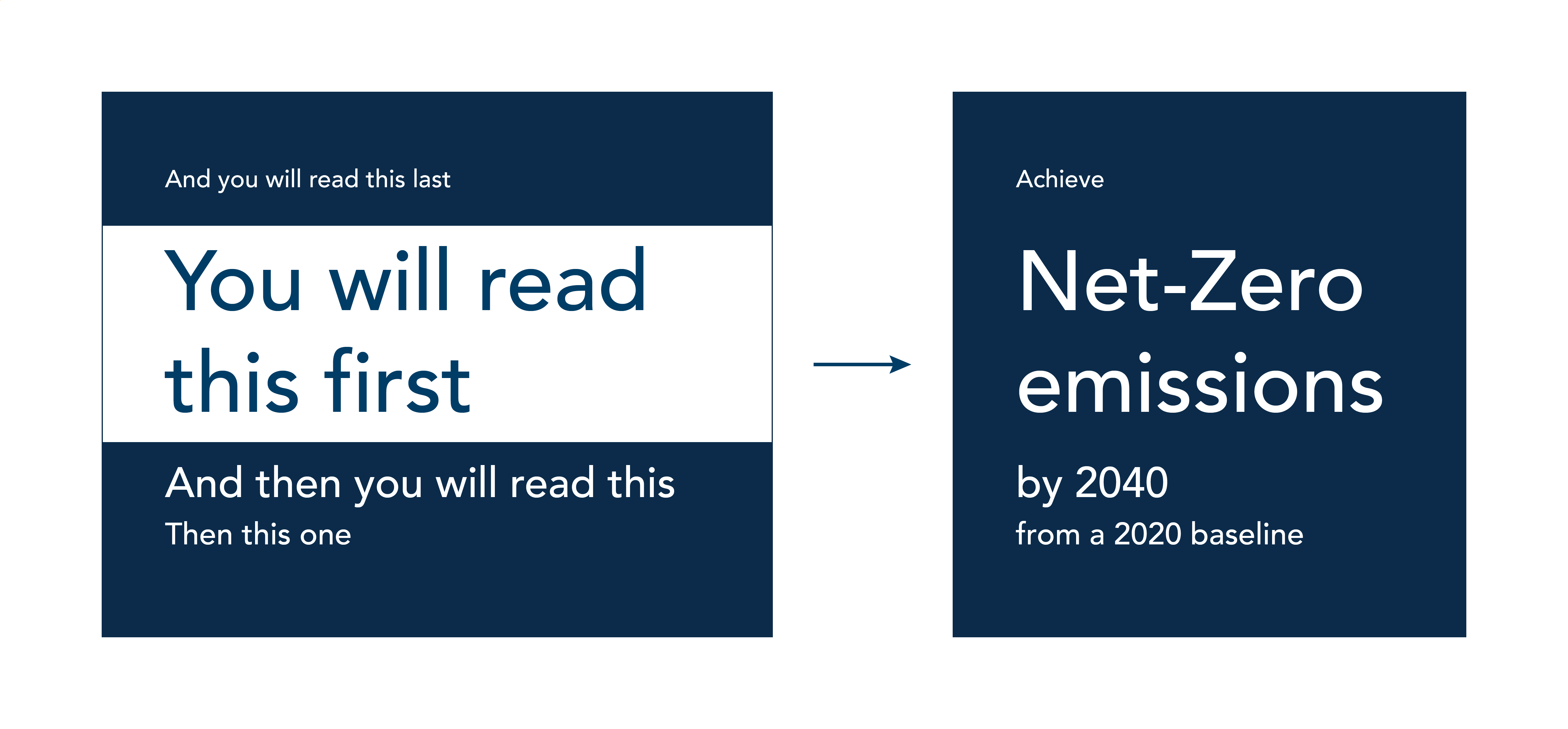
George Gorczynski – You need a visual hierarchy. The landing page for a well-crafted dashboard should be an overview or summary of your key data points. The visual hierarchy plays a pivotal role. It forces the reader to navigate the dashboard in a particular way and highlights the most important data points that summarise what you are displaying. This becomes particularly important when you have certain data points that you want to highlight for further interrogation.
One way to establish hierarchy is by using different font sizes.
You also need to consider the structural layout of your data and how you help the viewer to navigate, along with using visual cues like enclosures or colour to group related data together. Two common layouts for data display in Western-influenced countries are the F-pattern and the Z-pattern.
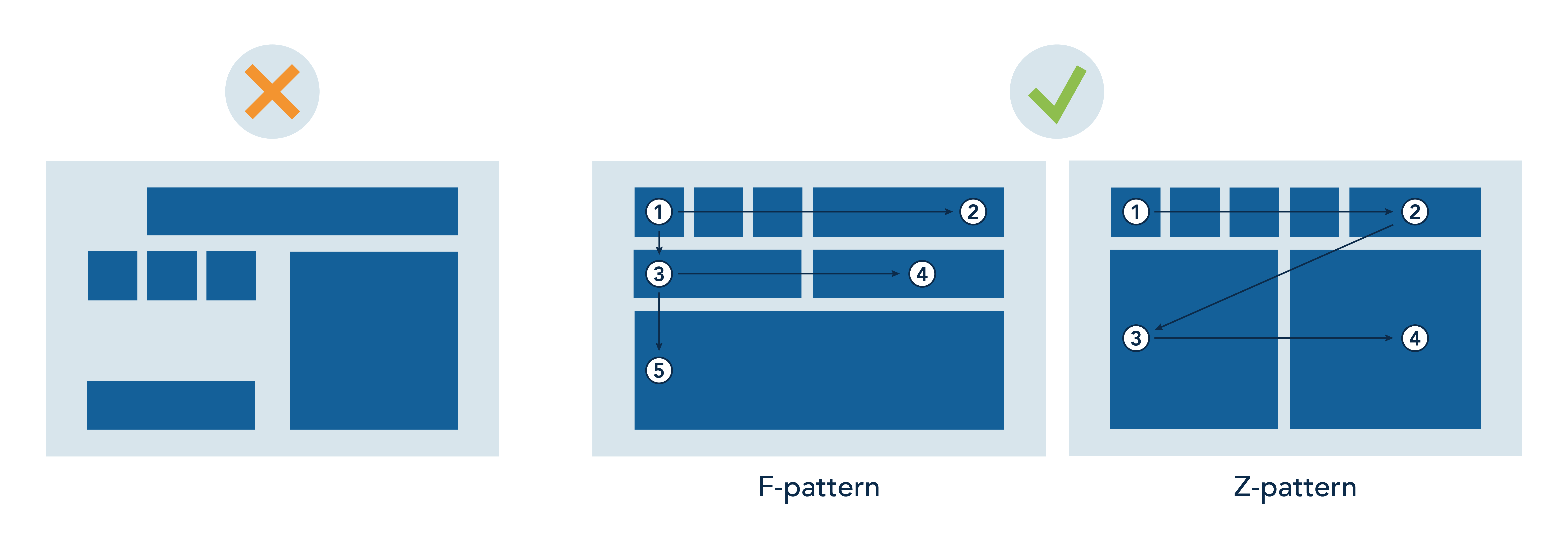
A clear layout not only adds to the visual appeal of the dashboard but also helps to clarify how you want the reader to read the data story. I encourage people to identify the most important KPIs and highlight those. Then, if needed, provide a deeper dive into a different section of the dashboard for the rest of the KPIs.
Embedding Project – What role does colour play? Sustainability teams are often trying to work within corporate brand colours.
George Gorczynski – You can use colour to highlight important data points and help to draw the reader to what you want them to focus on.
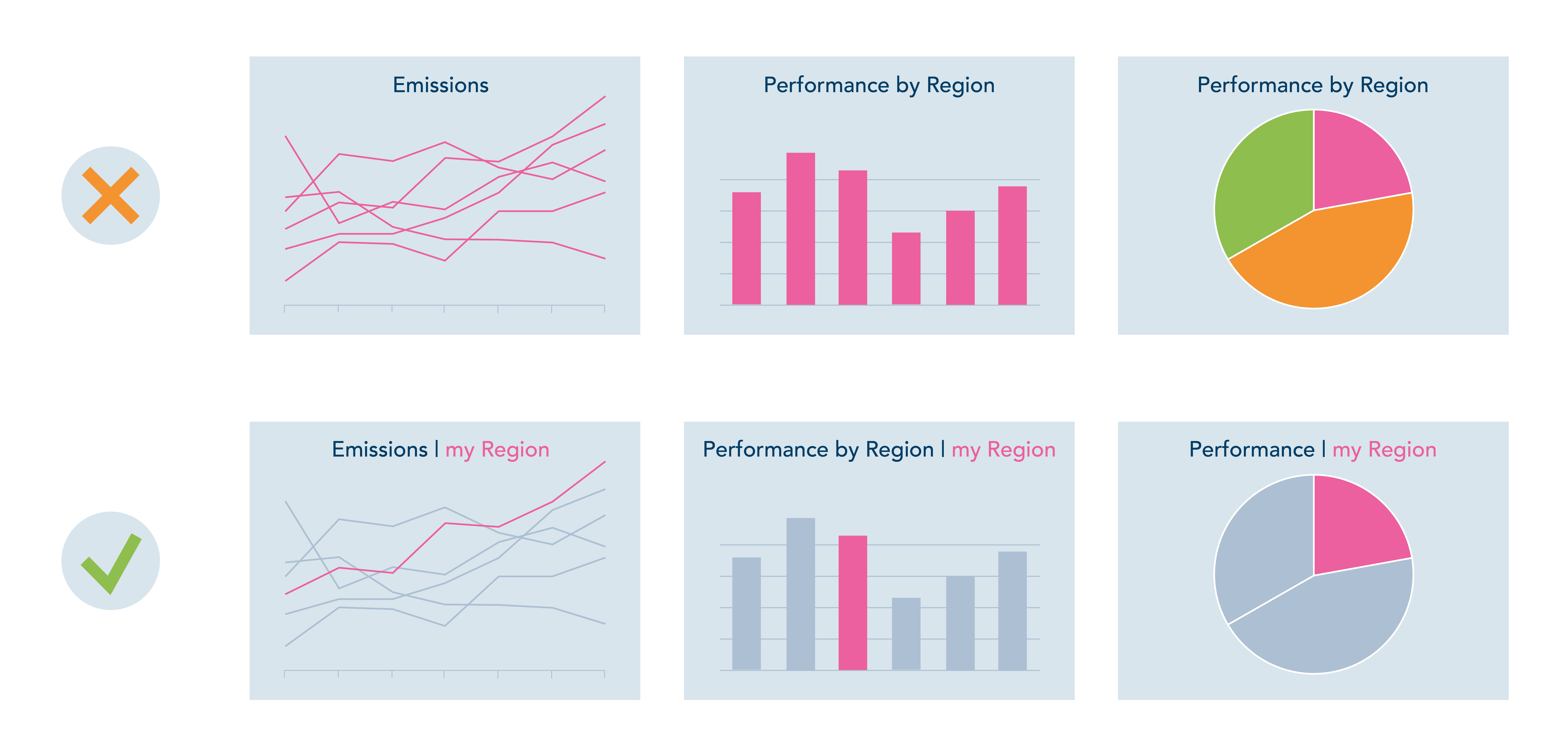
When selecting a colour scheme, try to choose a set of familiar or relatable colours. But you need to be careful with colours; some companies gravitate to exclusively using their brand colour palettes, and these may not always work well. For instance, there may not be enough variety. Or, if your brand colours are shades of red, psychologically, red is often associated with “poor performance, negatives, or loss” when it comes to data visualization.
Embedding Project – Does the chart type matter?
George Gorczynski – The type of chart you select plays a crucial role in how your message is understood. It's essential to choose a chart that reinforces your insights without unintentionally distorting them. For example, when presenting the map below, viewers might incorrectly assume that male life expectancy is highest in the USA, as it occupies the largest coloured area. However, the accompanying bar graph shows that Switzerland, which is barely noticeable on the map, has the highest life expectancy. This highlights the importance of using the appropriate chart type to ensure accurate interpretation.
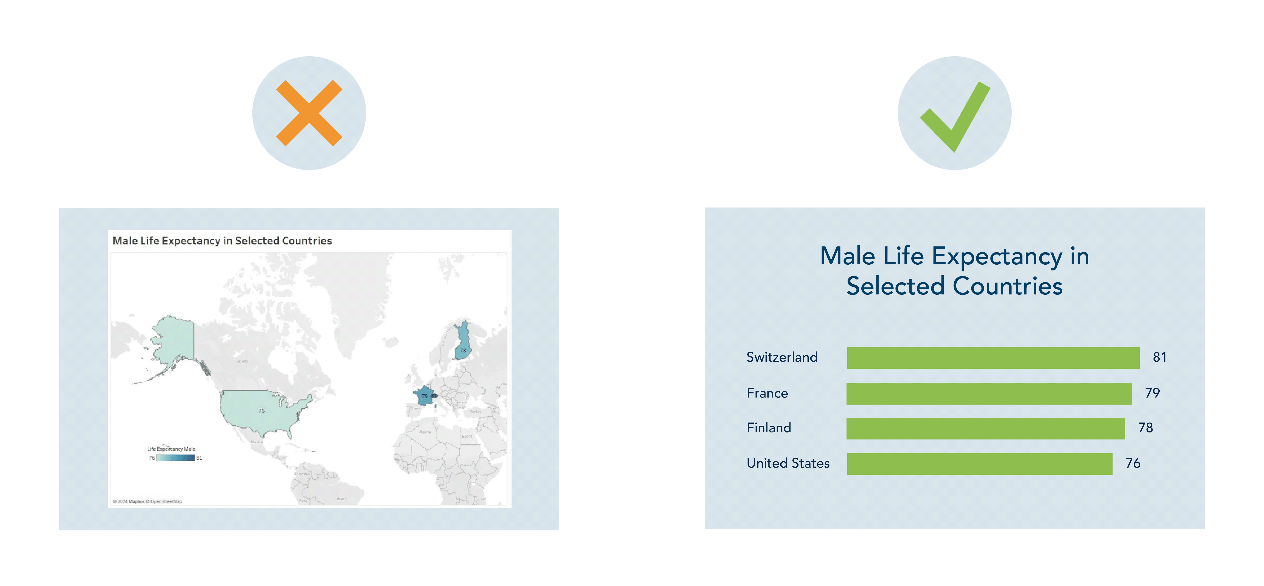
There are multiple options that one can choose from for effective visualization; it is important to understand the message that you are trying to relay before choosing a chart type. You can refer to something like the visual vocabulary guide to help you decide on the best visualization to use.
Embedding Project – When displaying sustainability data, including contextual information such as the baseline, the target, and/or any helpful benchmarks can be helpful. What visualizations are useful for demonstrating progress against a target or goal or benchmarking progress against others?
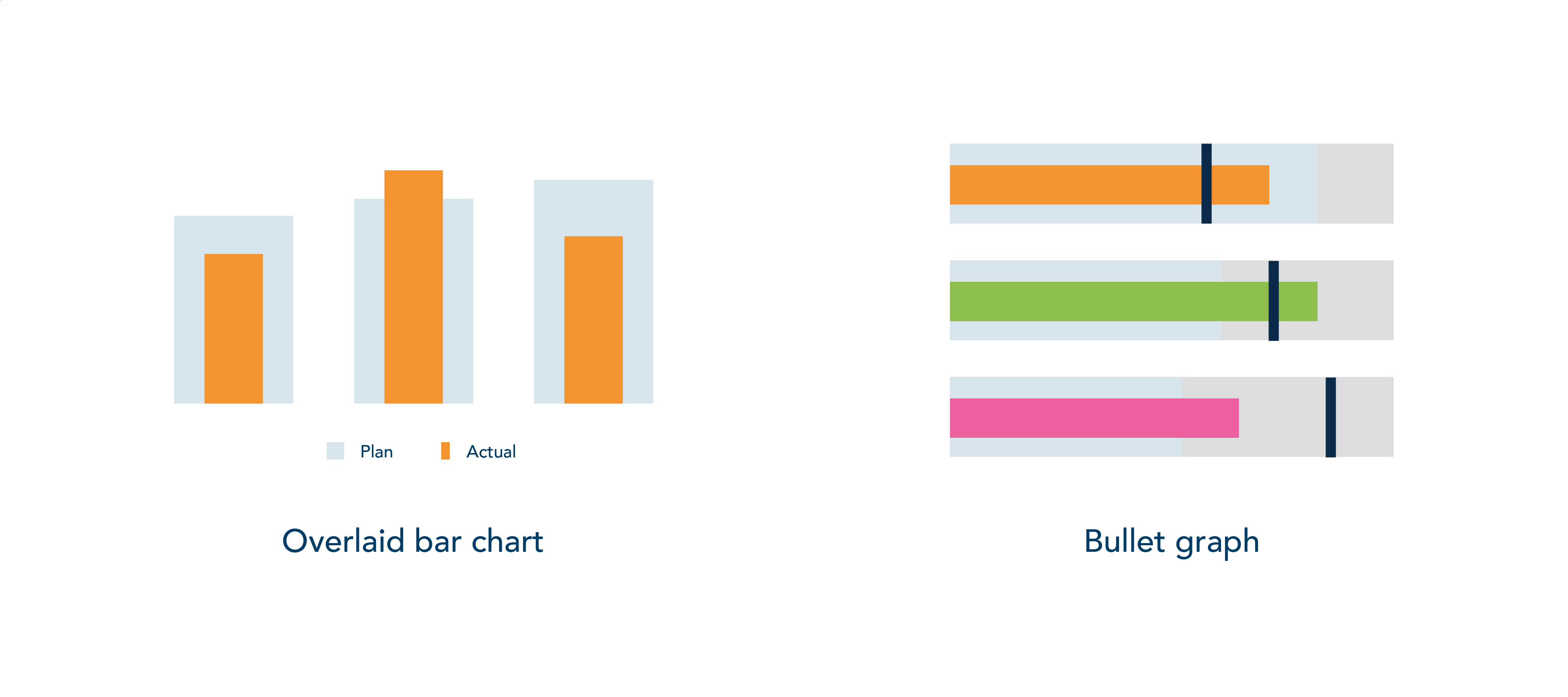
George Gorczynski - There are many ways to translate progress against targets into data displays – for example, using overlaid bar charts can be helpful to translate progress in KPIs with a wide bar defining targets and/or benchmarks you’re working towards and an overlying narrow bar to visualise the current date and progress against it. Other similar approaches, such as bullet graphs, can also compare where you currently are to your sustainability targets.
Remember that numbers don’t always need to be the focal point, the story is. When creating data to inform decision-making, remember that the aim is to illustrate patterns that have not been seen before.
Embedding Project – What would you say to someone who is looking to purchase a software tool to automate their data visualization?
George Gorczynski – There are many software solutions available for data preparation and visualization, each with its strengths and weaknesses. The best choice depends on your specific needs. Excel is ubiquitous and widely understood, making it a reliable option for simpler tasks. For more complex, interactive dashboards, Tableau and Microsoft Power BI are industry leaders. If your focus is on building standalone interactive charts, tools like Datawrapper, Flourish, or RAWGraphs are worth exploring.
Our thanks go out to George for sharing insights on data visualization. For additional resources and tools, be sure to visit George’s website and explore some of his recommended materials below. You can also follow George on LinkedIn, where he regularly shares practical guides on various data visualization topics. Simply search for the #vizableviztips hashtag.
Refer to this web page for a list of data visualization resources, including books, articles, podcasts, videos, and links to software tools.
On his blog, George offers insights on how to design data dashboards in Designing dashboards that delight: a UX guide, including user experience design principles and practical tips to make sure that your dashboards are useful, credible, well organised and accessible.
Why your enterprise needs a data visualization style guide highlights the benefits of having a style guide to ensure that your data products are consistent and impactful. It also offers step-by-step guidance on how to create your style guide.
One of the most comprehensive resources for selecting the right chart is the Visual Vocabulary poster created by The Financial Times. This resource offers dozens of chart examples categorised by the purpose of the visualization, such as showing distribution, ranking, change over time, and more.
If you use Tableau, this interactive version of the Visual Vocabulary will be extremely helpful.
The Data Visualization Society’s YouTube channel is also a great source of data visualization knowledge.
Footnotes
Image by Breaking the Walls on Shutterstock.